Article: The Wild Horse Club: The Story Behind Our Iconic New Logo
The Wild Horse Club: The Story Behind Our Iconic New Logo
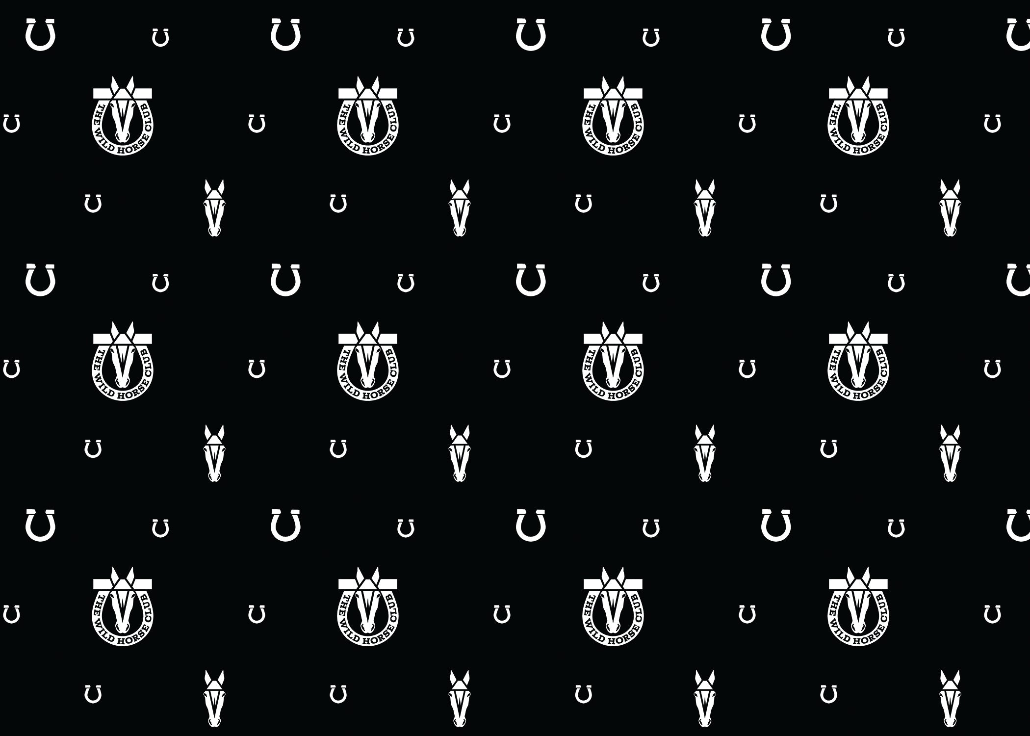
The Wild Horse Club Logo – Iconic Horseshoe Branding
Logos are strange creatures. They seem simple—just a mark, a symbol, a stamp of identity. But in reality, they’re some of the hardest things in the world to get right. They carry the entire spirit of a brand on their back. They need to feel effortless, timeless, and powerful all at once. And when you’re dealing with horses—those wild, untamable spirits—it’s almost impossible to create something that doesn’t feel cheesy, overdone, or trapped in cliché.
That’s the design mountain The Wild Horse Club had to climb. And after years of exploring, experimenting, and discarding countless ideas, we’ve finally arrived at a logo that embodies everything we stand for: freedom, rebellion, power, and timeless cool.
It looks simple, yes. But don’t let that fool you. This logo is the result of years of searching, questioning, and refining. It’s an evolution of vision, boiled down into a single, iconic mark.
⸻
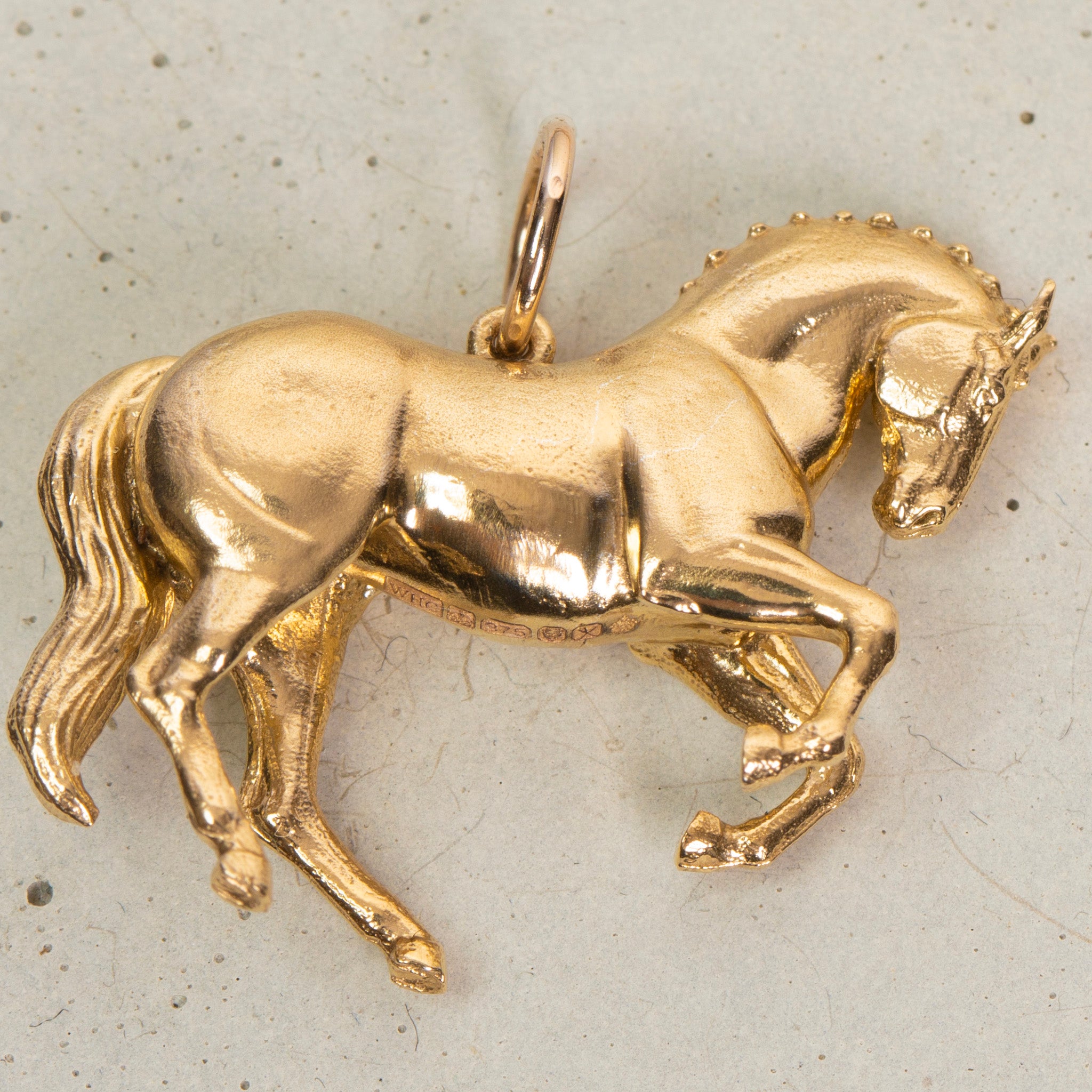
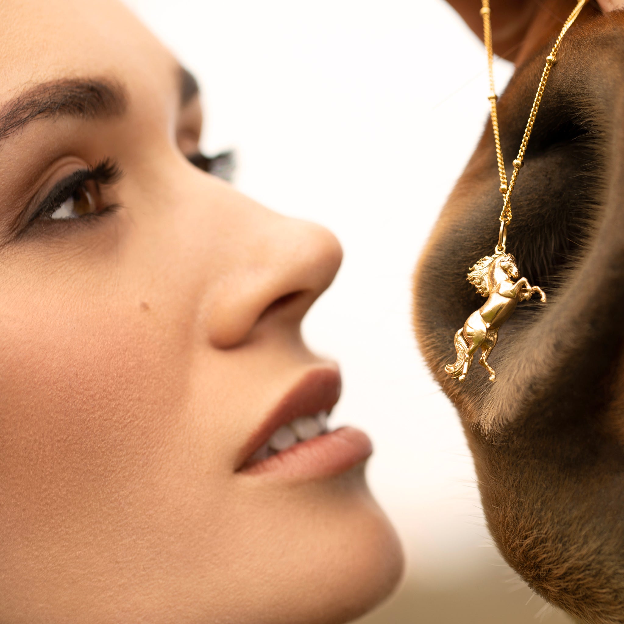
Why Horses Are Hard in Design
Let’s be real: horses are hard.
When most people try to design a horse logo, it almost always goes one of two ways. Either it turns into a cartoon—overly detailed, too literal, or a bit kitschy. Or it becomes generic: a swooshy silhouette that could just as easily be a sports team or a car rental company.
But The Wild Horse Club was never about playing it safe or falling into the trap of the obvious. We’re about channeling that raw, unfiltered spirit of the horse—wildness, beauty, rebellion—without letting it slip into cliché. That’s a razor’s edge to walk.
The challenge was to design something that feels timeless and classy, while still keeping that edge. Something that whispers luxury but shouts rebellion. That balance is the hardest thing to capture.
![]()
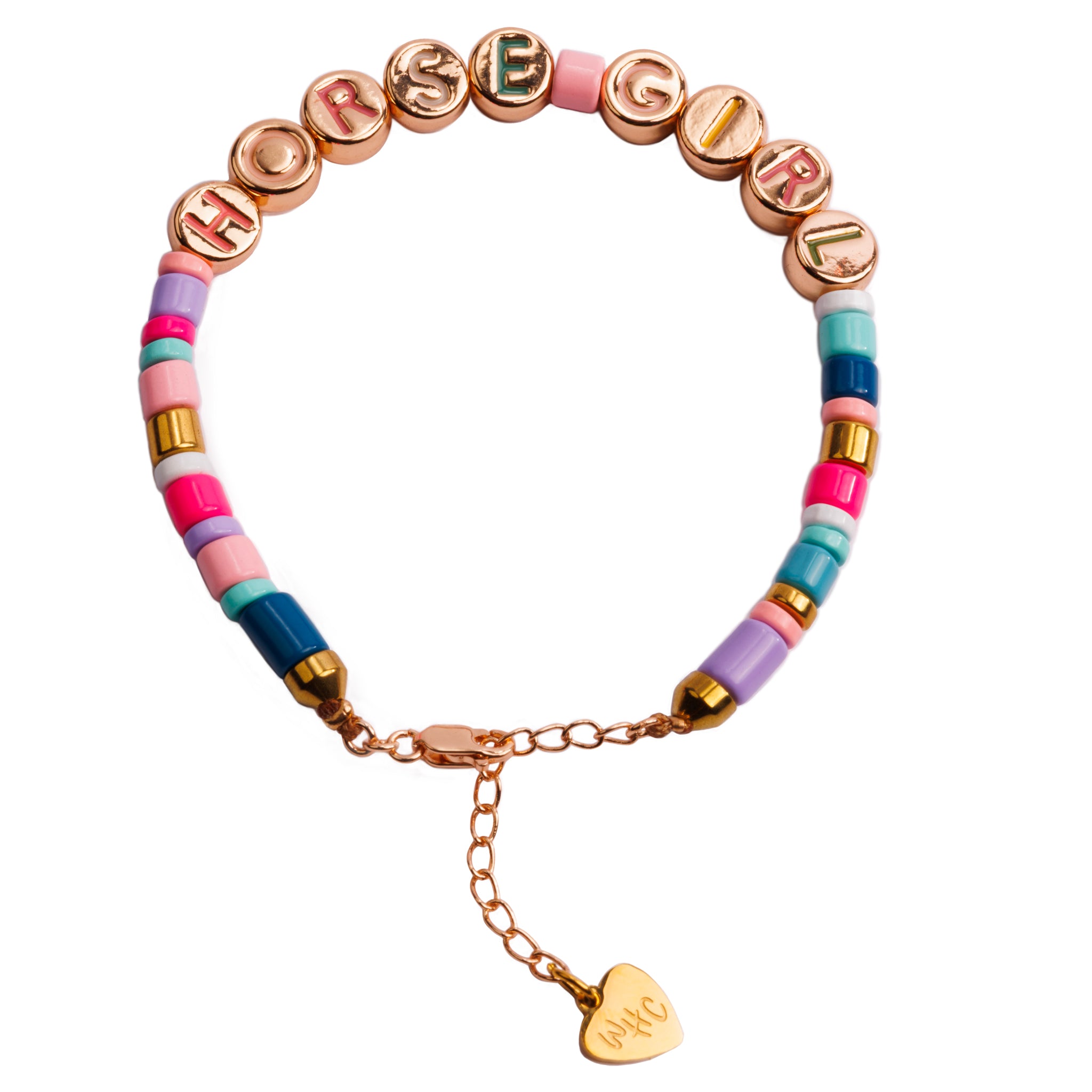
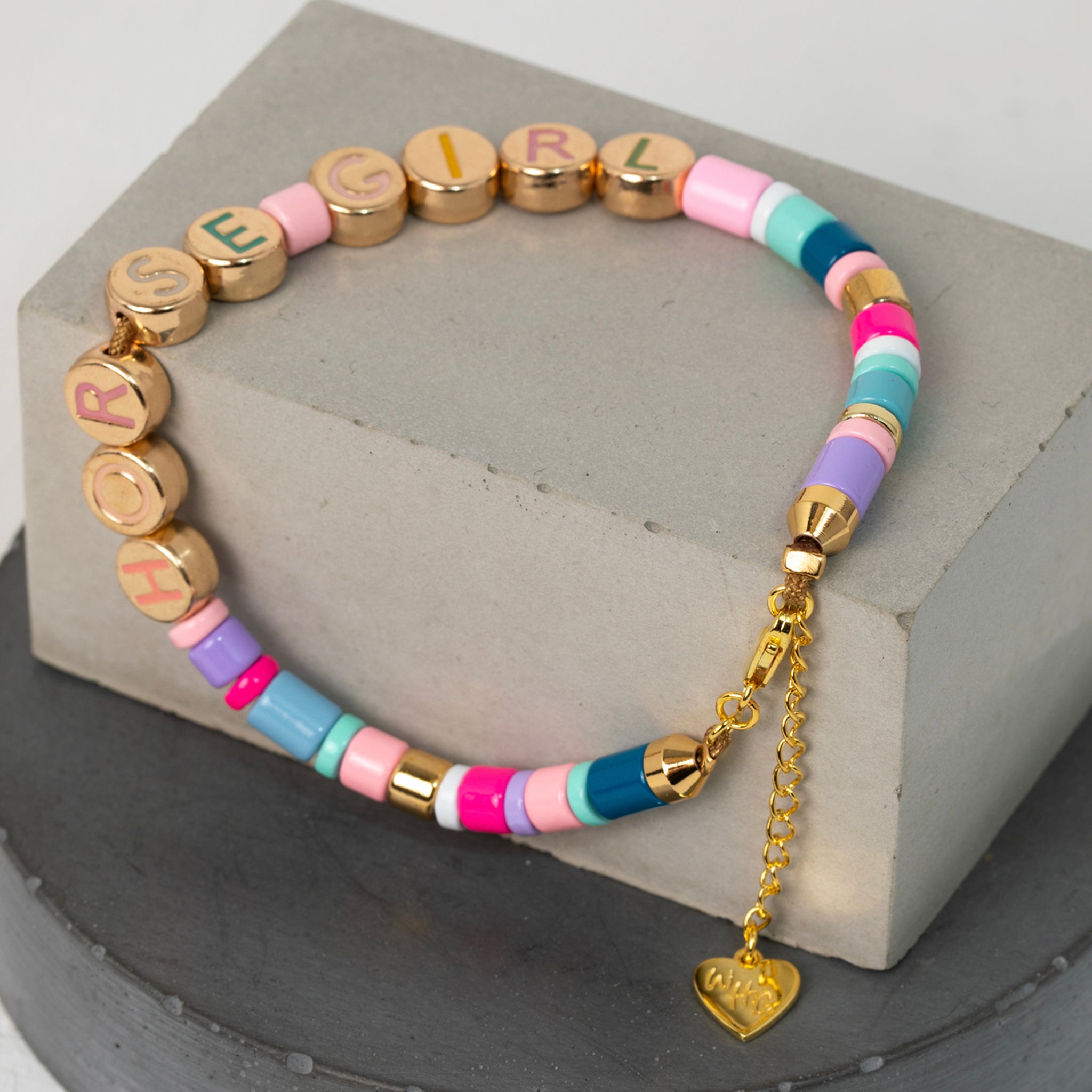
The Evolution of The Wild Horse Club Logos
This logo isn’t our first rodeo. We’ve been through multiple iterations—each one trying to pin down what The Wild Horse Club really is. Some designs leaned heavy on illustration. Others went abstract. Some felt too polished, too clean. Others tipped too far into grit.
![]()
Each version was a stepping stone. Each one was a necessary experiment in stripping back, refining, asking the hard questions. Because great design isn’t about adding—it’s about subtracting. Removing everything unnecessary until only the essential remains.
And that’s exactly what this new logo is: the essence of The Wild Horse Club distilled into one mark.
![]()
The Power of Simplicity

At first glance, the new logo feels almost stark. A horseshoe. A horse’s face. A crossbar cutting across the top like a horizon line. And the words: The Wild Horse Club curved into the shoe itself.
It’s clean. It’s bold. It’s instantly recognizable. And that’s the point.
The simplicity makes it iconic. There’s no fluff, no unnecessary detail, no distraction. Just pure form. This is the kind of logo you can stamp on a leather jacket, carve into metal, stitch into fabric, or project onto a wall at midnight, and it will still hold power.
Because logos don’t live in design software—they live in the real world. They need to work everywhere, on everything, in every context. And this one does.
IT TOOK US A WHILE TO GET THERE


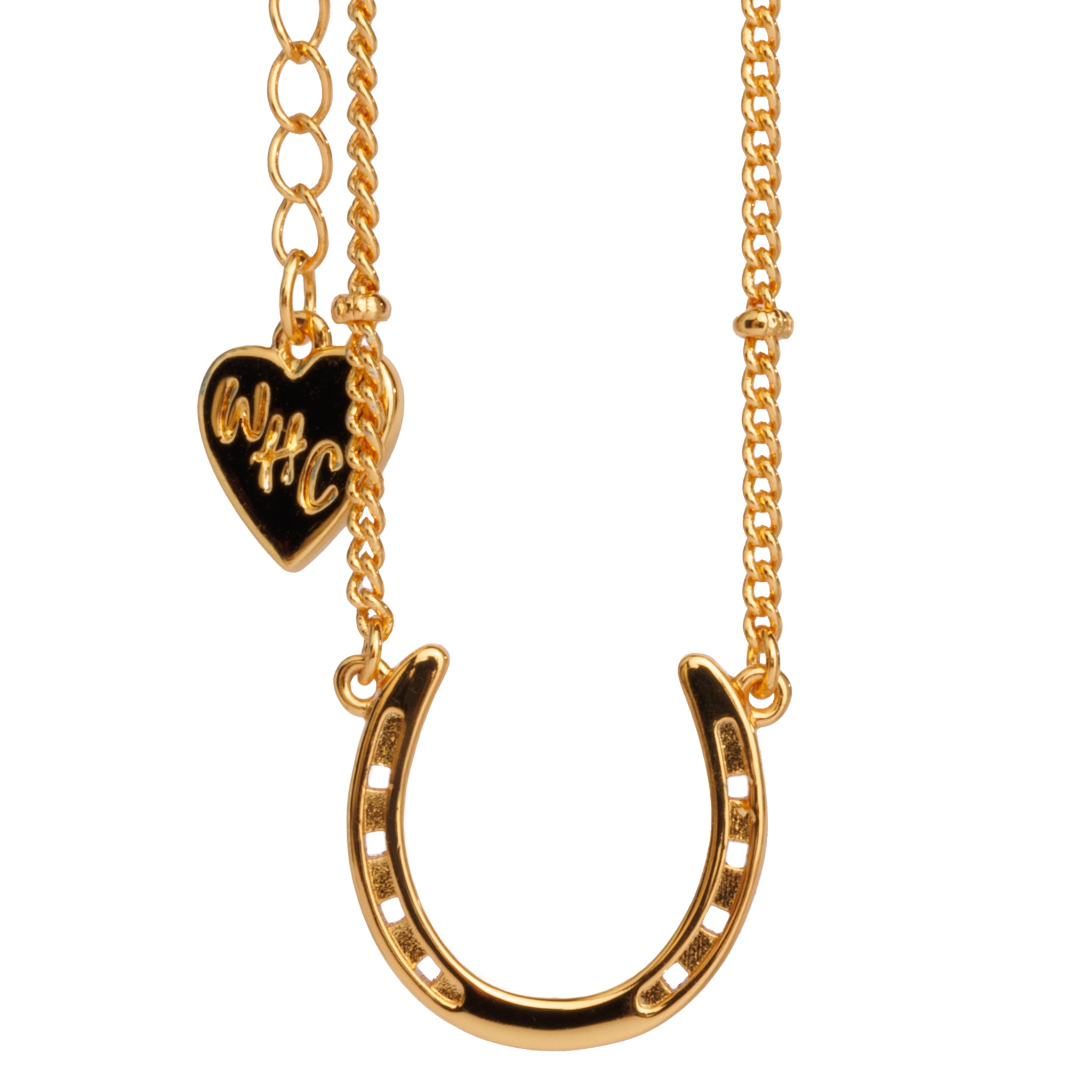
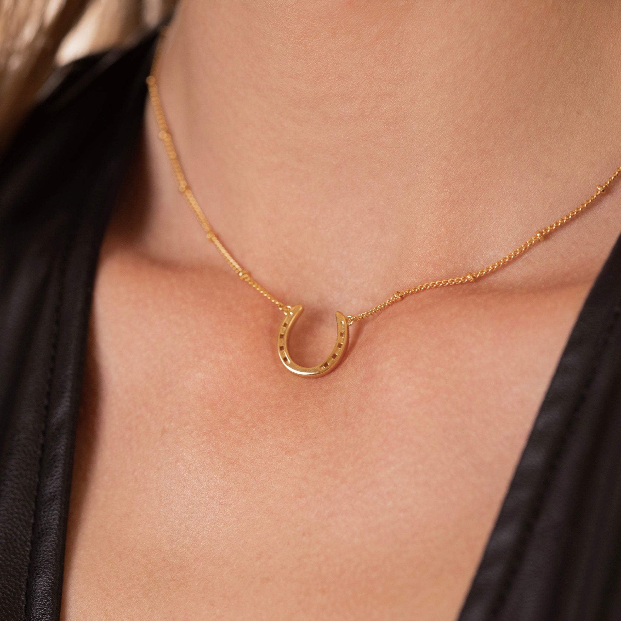
The Horseshoe: A Symbol of Strength and Luck
The horseshoe has always been a powerful symbol—luck, strength, protection. But here, it’s more than that.
Framing the horse’s head within the horseshoe gives it weight and authority. It anchors the wildness of the horse within a shape that feels timeless and strong. The curve of the shoe draws the eye inward, centering the horse, making it impossible to miss.
But it’s not the typical “lucky horseshoe” trope. It’s modern, stripped back, powerful. It doesn’t feel like folklore—it feels like rebellion stamped in steel.
⸻
The Horse: Icon of Freedom
The horse itself is minimal. A few lines, a few shapes, and suddenly the face appears. It’s not trying to be hyper-realistic. It’s not drowning in detail. It’s iconic—bold and abstract enough to be timeless, but still instantly recognizable as the spirit of the horse.
It looks forward, unflinching. It feels proud, unbroken, defiant. That’s the essence of The Wild Horse Club.
⸻
Typography That Demands Attention
The words THE WILD HORSE CLUB curve around the horseshoe like a banner. The font is bold, unapologetic. There’s no room for hesitation or softness. This is typography that holds its own weight, that declares its presence.
It doesn’t whisper—it speaks. Loud and clear. Because The Wild Horse Club has always been about owning your identity, your freedom, your wildness. The typography makes sure nobody misses it.
⸻
The Crossbar: A Subtle Rebellion
And then there’s the crossbar cutting across the top. Simple, geometric, almost architectural. It balances the vertical energy of the horse’s head. It turns the logo from just a horseshoe into a mark with structure, symmetry, and edge.
It’s a quiet rebellion against what you expect from a horse logo. A subtle break from tradition. That’s the Wild Horse spirit—taking something classic and flipping it on its head.
⸻
The Years Behind the Simplicity
People see a logo like this and think: “That must’ve been easy.” But that’s the trick of good design—it looks effortless only because of the years of work behind it.
It took countless attempts, countless failures, countless redraws to get here. Every line was fought for. Every angle was tested. Because when you’re trying to capture something as complex as the spirit of wild horses, you can’t settle for almost right. It has to be perfect.
And that’s why this logo matters. It’s not just a design—it’s the result of years of chasing the wild horse through the desert of creativity, refusing to let it slip away.
⸻
A Mark That Feels Like a Cattle Brand
At its core, the inspiration for this logo came from the idea of a cattle brand. Something seared into leather, permanent, undeniable, a symbol of belonging and identity.
That’s what this logo is meant to feel like: not just a picture, but a mark. Strong, bold, unmistakable. The kind of thing that carries weight because it feels eternal, as if it’s always existed.
This wasn’t about decoration. It was about creating a brand in the truest sense of the word—an emblem of ownership, of pride, of spirit. A cattle brand for the wild ones.
⸻
The Vibe: More Than a Brand
The Wild Horse Club has never been about just one thing. It’s not just fashion, not just art, not just lifestyle. It’s a movement. A way of being. A declaration that you will never be tamed.
And now, with this new logo, we finally have a mark that feels worthy of that spirit.
It’s bold but classy. Simple but powerful. Clean but wild. It balances all the contradictions that make The Wild Horse Club what it is.
⸻
Looking Ahead
This is more than a logo—it’s the next chapter. From here, The Wild Horse Club rides into new territory. New projects, new art, new creations. And this logo is the stamp that will mark all of it.
You’ll see it on leather. On silver. On fabric. On the walls of spaces where freedom and rebellion live. It will become a symbol that transcends just “design” and becomes identity.
Because The Wild Horse Club isn’t just a name—it’s a spirit. And this logo finally captures it.
⸻
Final Word
Designing a horse logo that doesn’t feel cheesy is one of the hardest creative challenges out there. It’s easy to fall into cliché. It’s hard to find that balance between power and elegance, rebellion and class.
But after years of searching, refining, and pushing through every wrong turn, The Wild Horse Club has arrived at something iconic.
This logo is more than a mark. It’s a declaration. It’s the spirit of freedom captured in black and white.
And for the first time, when we look at it, we know: this is The Wild Horse Club.

Leave a comment
This site is protected by hCaptcha and the hCaptcha Privacy Policy and Terms of Service apply.